Network DVD
Compiled by Martin Willey
The Carlton prints were from the 1990s. Although they were generally good (and vastly superior to the previous VHS and laserdisc releases), some episodes were dark, with murky colours and with some sound faults (they were generally superior to the A&E sets in the US, which used the same prints but with obviously less quality control).
A new digital restoration of the Year One episodes was made for the Network release. Granada created new 35mm film elements in 2004 (an interpositive, made from the original negative, and used to make further copies). HD (high definition) digital transfers were made from the interpositives, by Jonathan Wood at BBC Resources using a state-of-the-art Philips Spirit Datacine. Each frame is cleaned up and colour balanced. The image was then processed with noise reduction (to reduce the film grain) and manually cleaned up to removes the remaining blemishes.
In general, the picture is more colourful and has stronger contrast. Uniforms and the Moonbase sets are beige, not grey. The flame red Main Mission sleeve stands out strongly. The difference between Alan Carter's orange sleeve and Sandra's yellow sleeve is obvious. Blacks are black, not dull grey. SFX scenes are particularly impressive: stars and colourful star fields are much more clearly seen, although wires don't become more obvious (they aren't hidden, either). SFX scenes also show some restoration problems- reducing the contrast means some spacecraft that looked effective with dark shadows look more like models when brightly illuminated. A few shots have become much worse- see the moonbase shots in Black Sun below.
There is slightly more picture visible around the margins (the microphone at the start of Force Of Life does not appear- the image dimensions are the same as the Carlton release for that shot). A few episodes that were very dark on the Carlton DVDs now show more image detail, but mostly you cannot see details you didn't see before.
Below is a sampling of different images from the Carlton and Network DVD releases. The images have been resized and compressed, so are poorer quality than on a TV screen. There is a comparison of the Network DVDs and the HD version here.
| Carlton | Network | Comments |
|---|---|---|

|
|
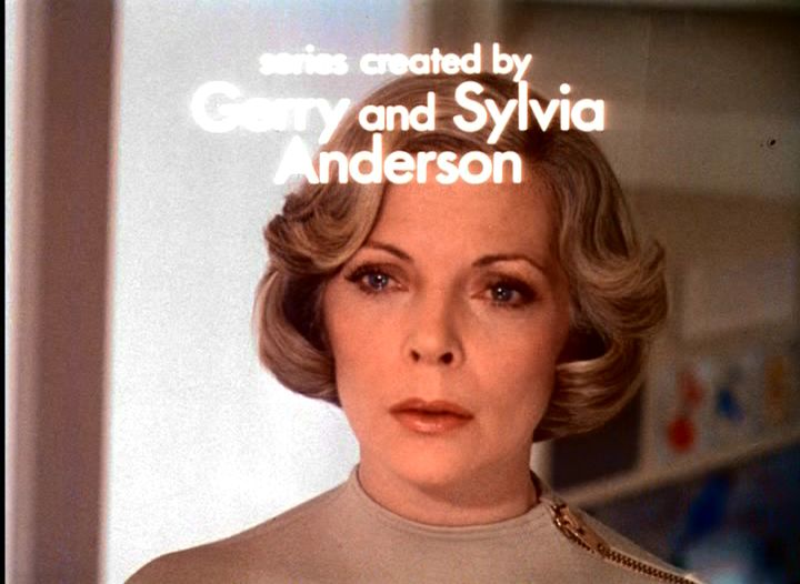
A very clear, clean image, showing slighly more picture around the margins. The titles were reconstructed from the text-free version prepared for foreign language editions (which can be seen on the Extras disc). The white background of the Martin Landau credit was always very dirty- it is pure white now. |
|
|
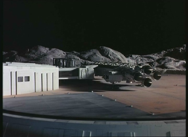
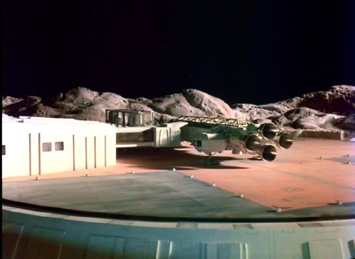
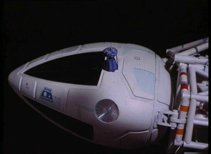
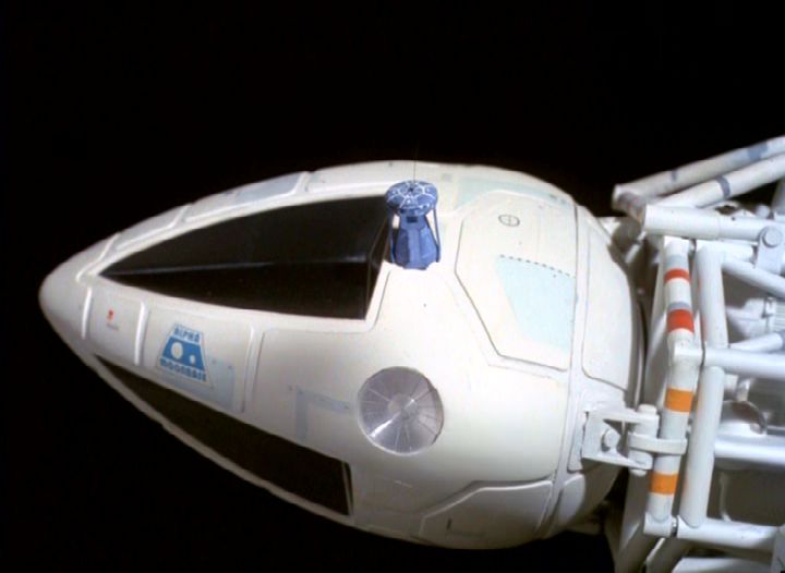
In the original, most of the 22 inch Eagle model is hidden in dark shadow. |
|
|
The reds are much stronger. The Eagle seats have become brown, rather than dark grey. The Carlton picture shows interference on the bulkhead grills, not present on the Network version (screen captures were done in the same way for both). |
|
|
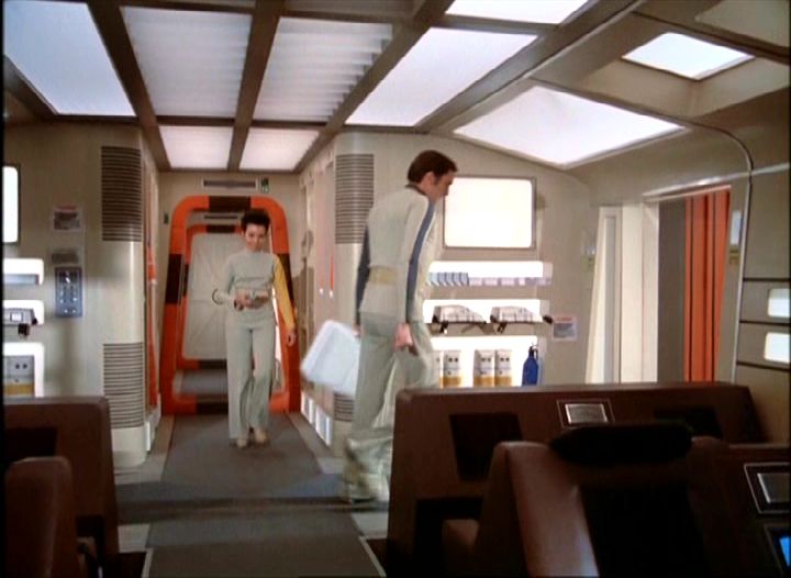
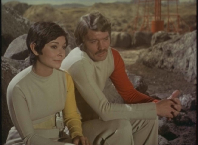
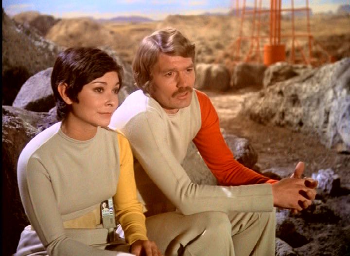
Although similar, the Network picture is brighter. While the uniforms looked grey in the Carlton version, they are beige in the Network release (as were the costumes in reality). |
|
|
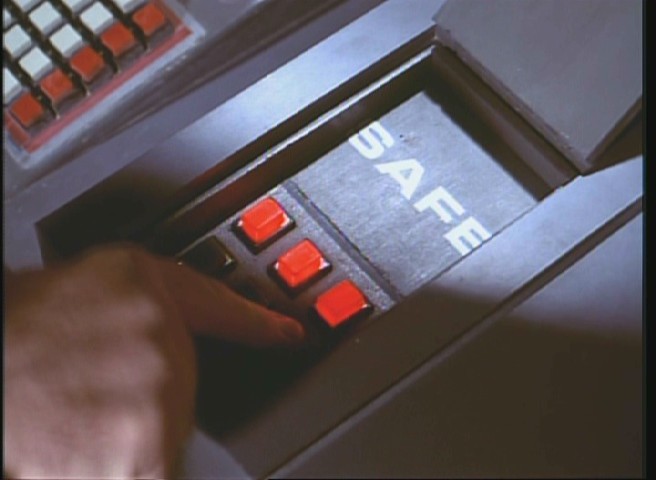
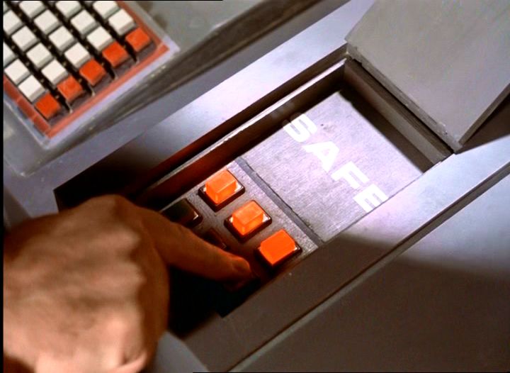
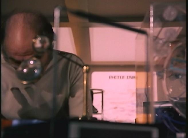
In end credits (and sometimes titles), the on-screen titles were clear in the Carlton sets but are sometimes unreadable in the Network sets. See also these shots: Network and Carlton. The background writing ("Photon Drive") is only readable in the Carlton version. |
|

|
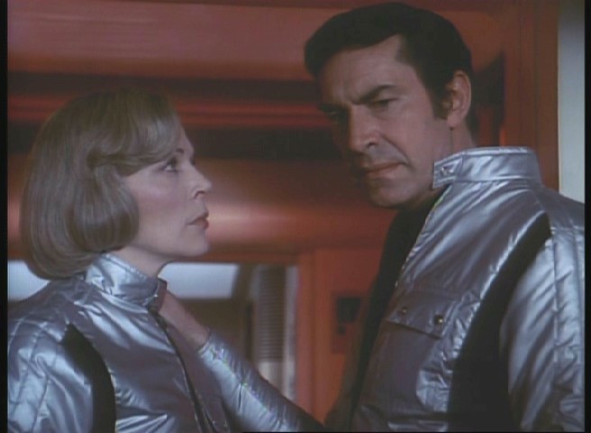
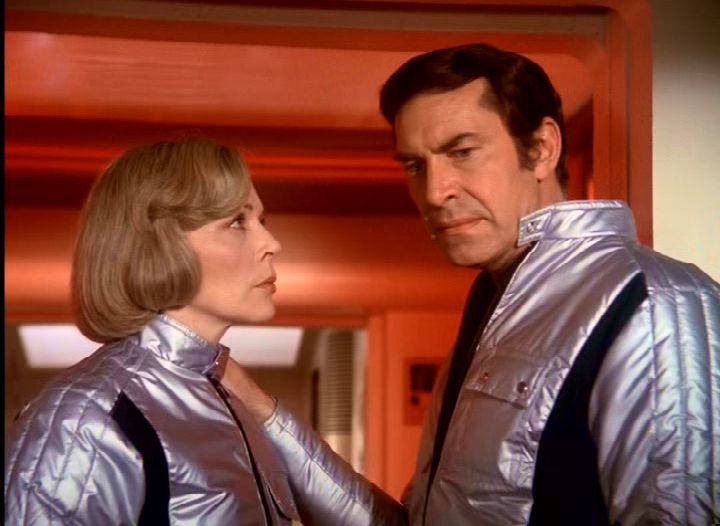
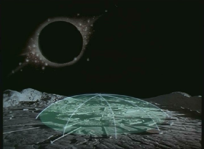
Note how the colour of the forcefield perspex stands out (and the reflection of Morrow's sleeve). |
|
|
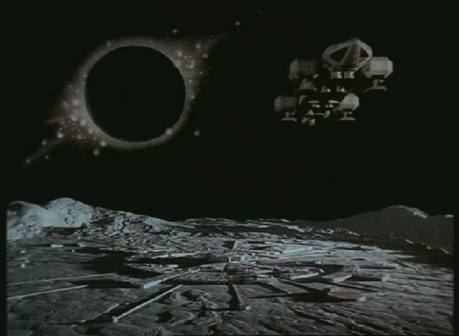
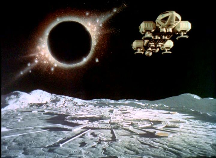
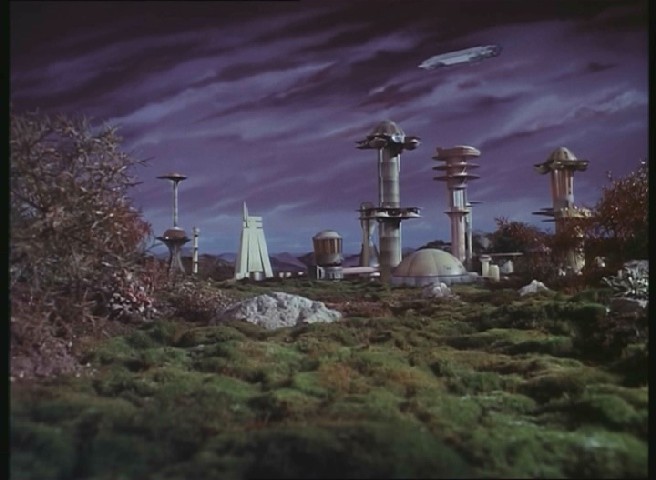
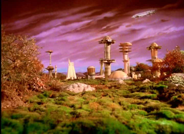
Something goes wrong in this Network shot- the Moonbase looks washed out, and while the black sun reveals some red colours, the halo looks grainy and loses some detail. The original is dark and effective, but the Network version looks fake. (The lunar hills on the right look flat in both versions, but the Network shot makes the whole thing look like a poorly developed photograph). Shots with the forcefield look more blurry (original, Network) |
|
|
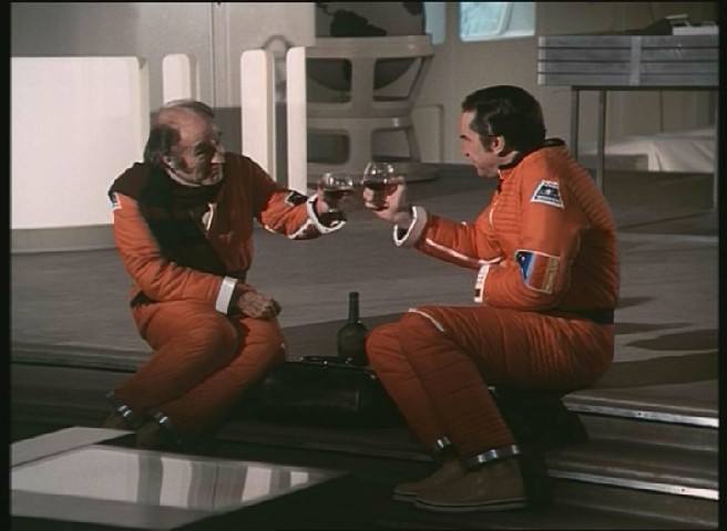
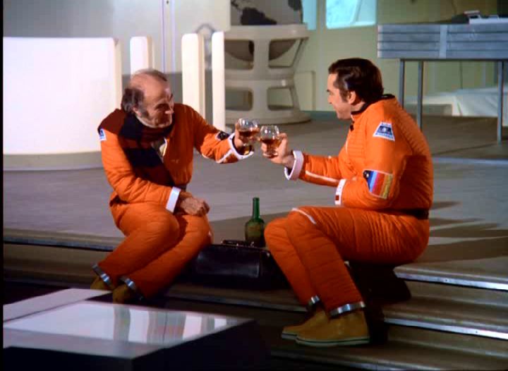
Superficially similar, but notice you can see the stripes in Bergman's scarf. The green of the bottle and the blue of the window in the background stand out too. |

|
|
Ring Around The Moon was done no favours by the dull and gloomy picture on the Carlton set. In the Network set, the lunar surface is visible. |
|

|
The Eagle is barely visible in the Carlton version- it's hard to see it is an Eagle. |
|
|
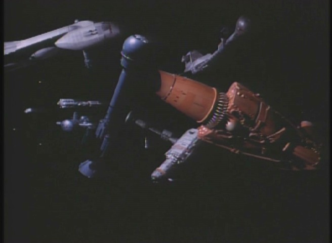
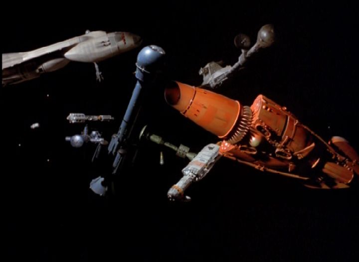
Although the picture is clearer, wires are not more obvious; they are still seen, but no more so than the original shot (on the blue probe). The blues are much lighter in the Network version, and the bands on the Eagle framework are more yellow than orange. Most of the shadow under the Eagle nose seen in the Carlton version is gone. |
|
|
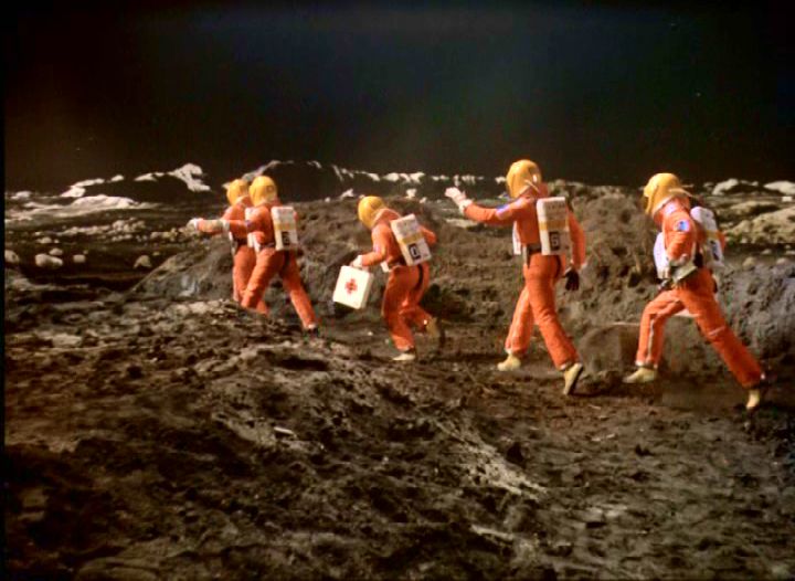
A much brighter shot in the Network version. The dust storms (and in Death's Other Dominion blizzards) can show pixelation (square blocks due to the compression of the digital picture), but the extent seems much less than the Carlton set. |
|
|
An example of the Network picture losing detail. A much brighter picture- but the on screen text is unreadable. |
|

|
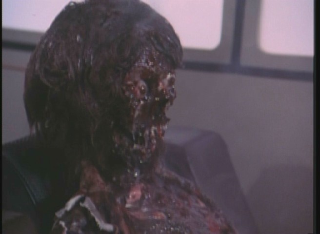
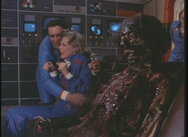
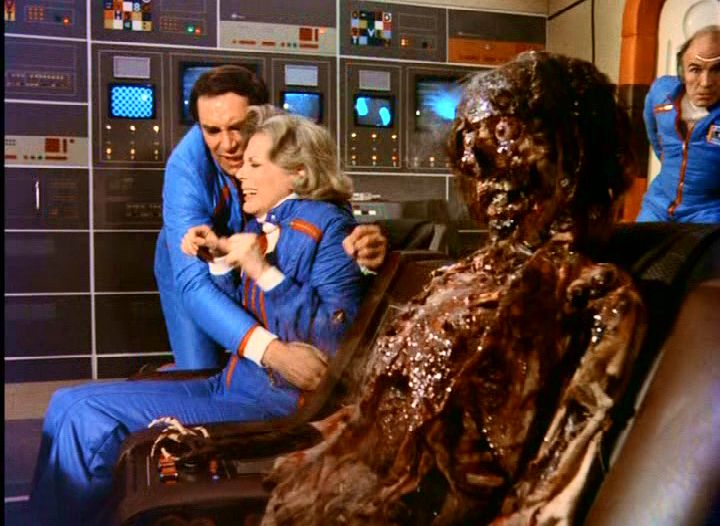
A much clearer picture shows off the grisly makeup. |
|
|
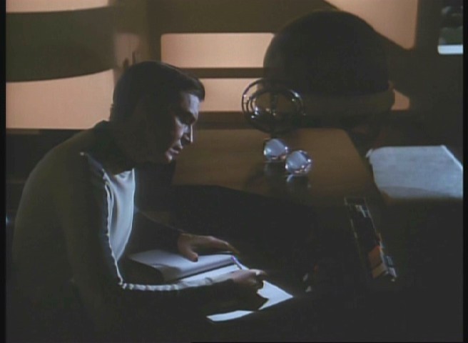
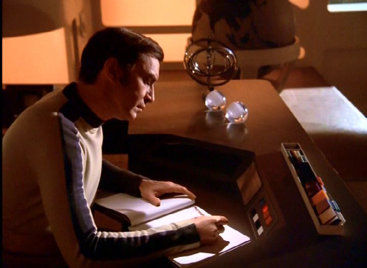
Although some film marks have been cleaned, a few are still visible. The white mark on Bergman's forehead (more visible as the camera pans right) is still present. |
|
|
The landscape changes from a dark and cloudy sky to a bright and sunny one. In comparison, the original is dull, but it is arguably more atmospheric than the new version which is obviously a model set. The alien skies in War Games have changed from purple (like the alien robes) to red. |
|

|
The Carlton picture is cloudy and dull compared to the Network version. |
|
|
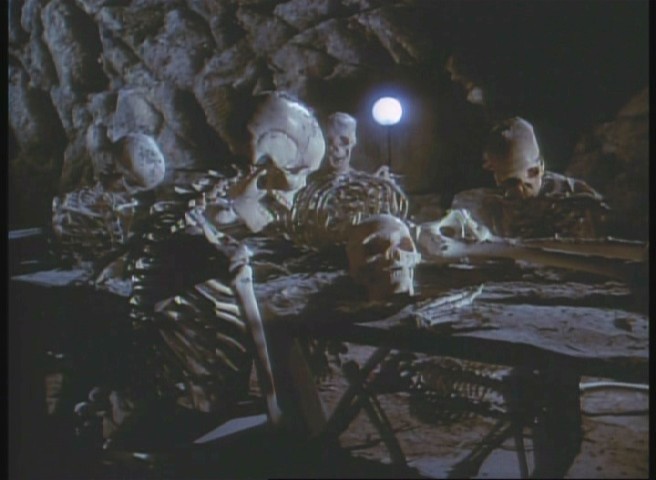
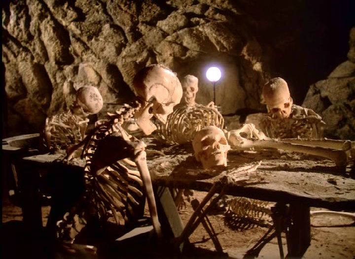
Sharper contrast and colour mean more detail is seen in the graveyard models. |
|

|
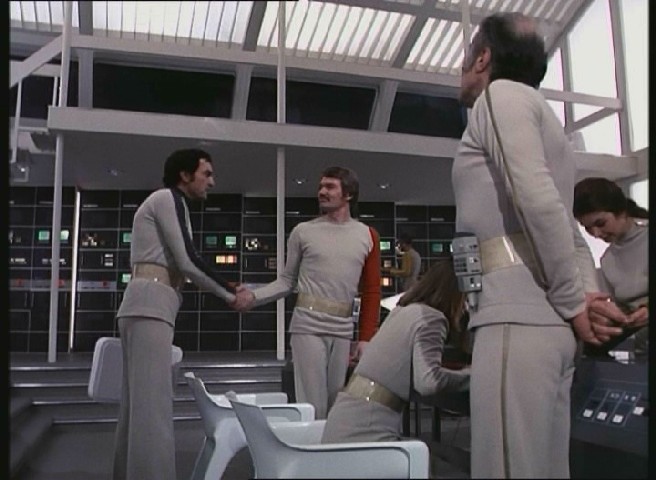
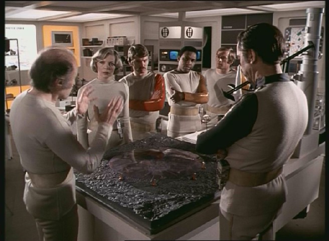
Greater clarity means a few effects look less impressive, but overall the quality of the sets, costumes, props and model effects is actually enhanced. |
|
|
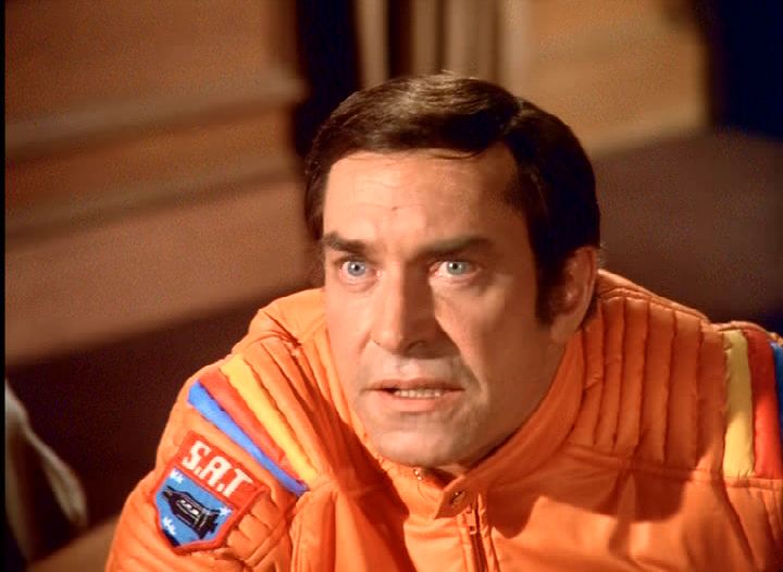
Martin Landau's eyes seem more piercing. |
|
|
Less shadow and more contrast makes a much clearer picture. |
|

|
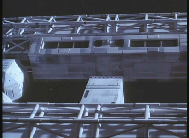
The Eagles in the Carlton picture have a bluish tinge. Details in the models become clearer in the Network version, and there are even stars visible. |
|
|
A much sharper picture with less murky colour. |
|
|
The orange of the wall lights gives the Network picture more warmth; the Carlton picture is too dark and the shadows are dull, rather than sharp. |
Copyright Martin Willey ;
packaging and screen images copyright Network Video