Labels
Various labels were quickly made from Letraset rub-down lettering. Letraset was founded in the UK in 1959, and their dry-transfer lettering, invented in 1961, became a world-wide standard for commercial artists. Letraset also designed many popular fonts. They even produced transfers for children from 1964, named "Action Transfers" from 1969; two Space: 1999 sets were produced in 1975.
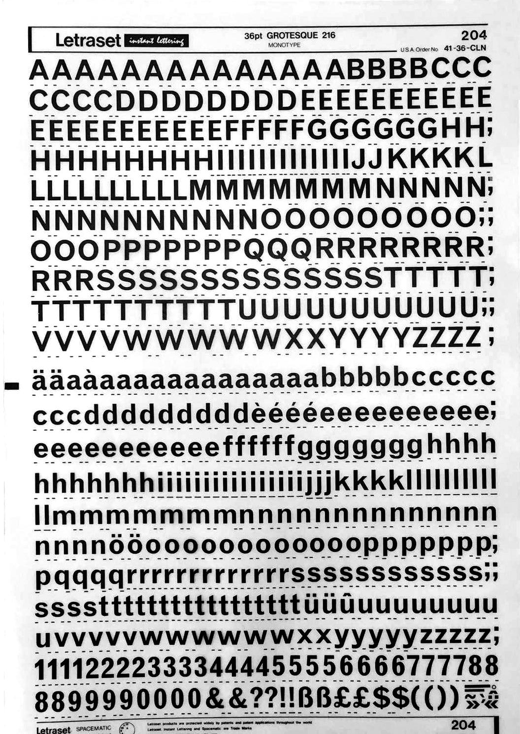
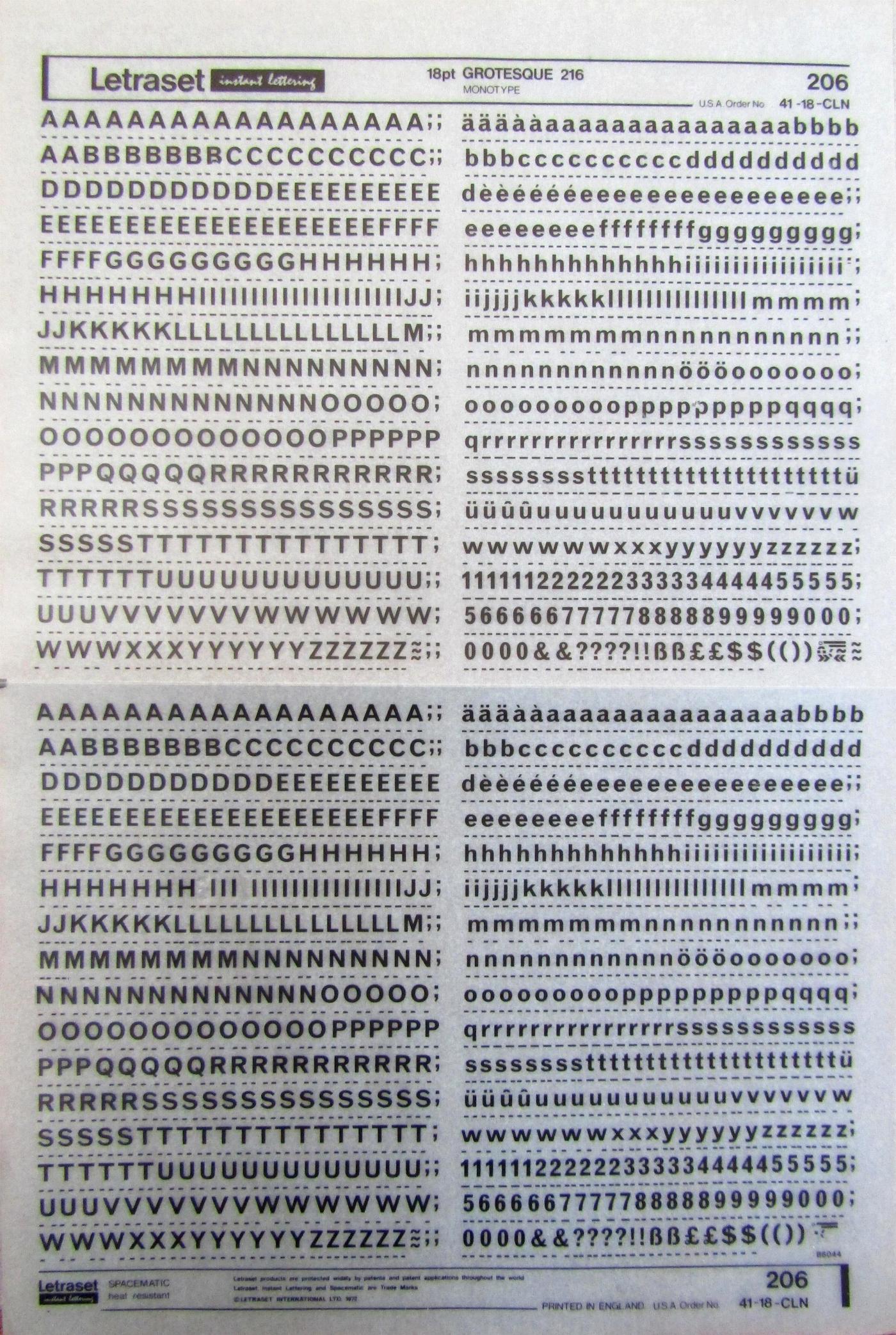
A 1970s Letraset "Instant Lettering" sheet, for 36pt Grotesque 216, created by Monotype. The sheet number (204) and USA Order No (41-36-CLN) are top right. As well as using the letters to create Moonbase labels, the Space 1999 set designers used the sheet numbers and USA order numbers, as well as some of the font names. The word "Spacematic" is often seen on labels, suggesting something suitably futuristic. The "Spacematic" word actually refers to the Letraset system of marks to indicate letter spacing.
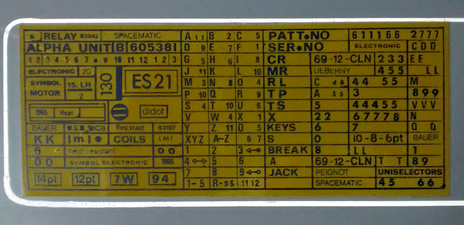
The "ES21" label is seen in many places - here on a computer panel. It's also on a medical panel, Command Center desks, a microscope, a radiation unit, and cases. (Photo thanks to Simon and David).
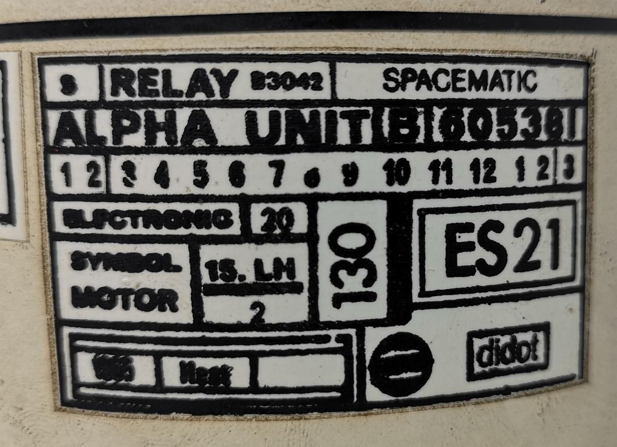
Here is a section of the ES21 label on a a microscope.
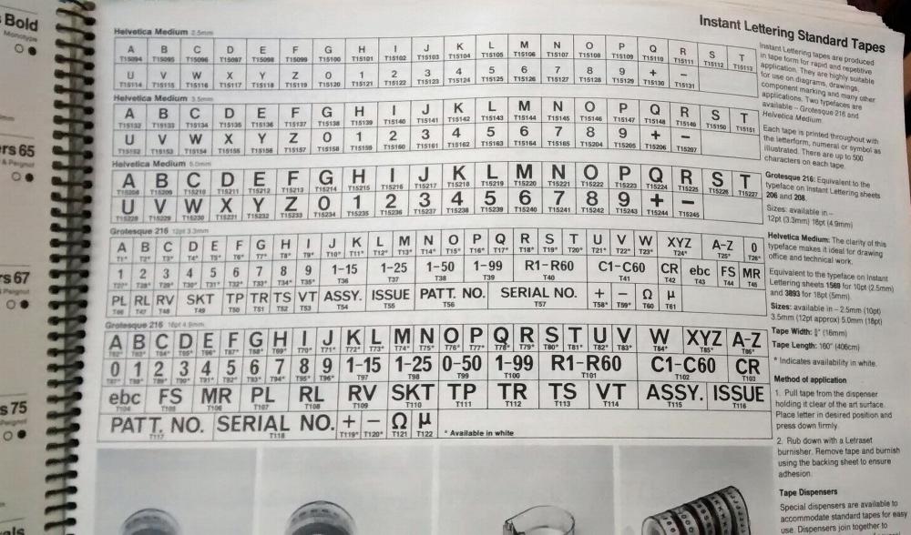
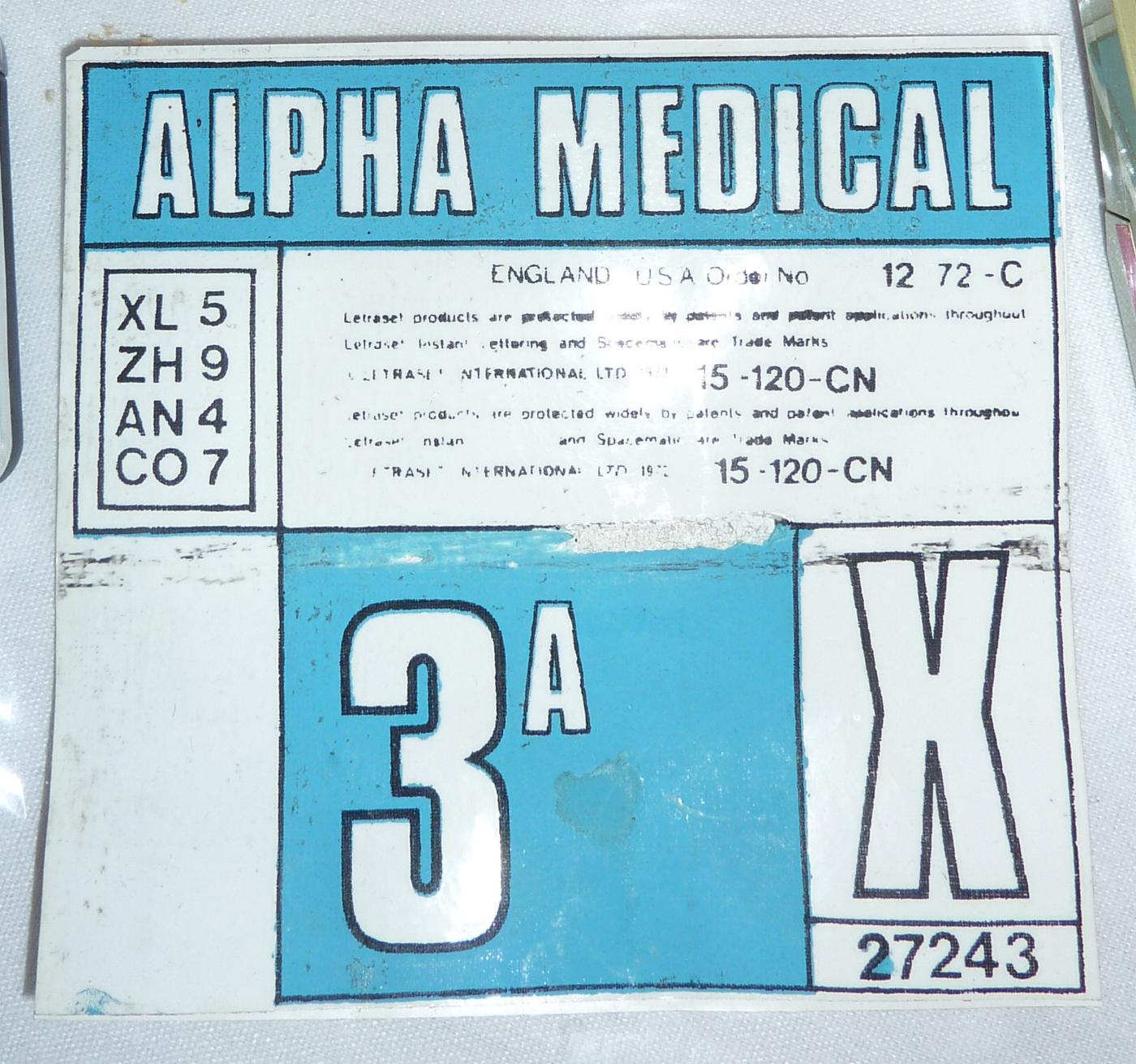
A Letraset catalogue, showing the fonts in tables. These tables of letters were produced exactly in some of the labels- even down to the order codes under each letter ("A" in Grotesque 216 has the code "T1"). Certain common works used in industrial designs are included in the table- "Assy" (assembly), "Issue", "Patt.no." (pattern number), "Serial no.".
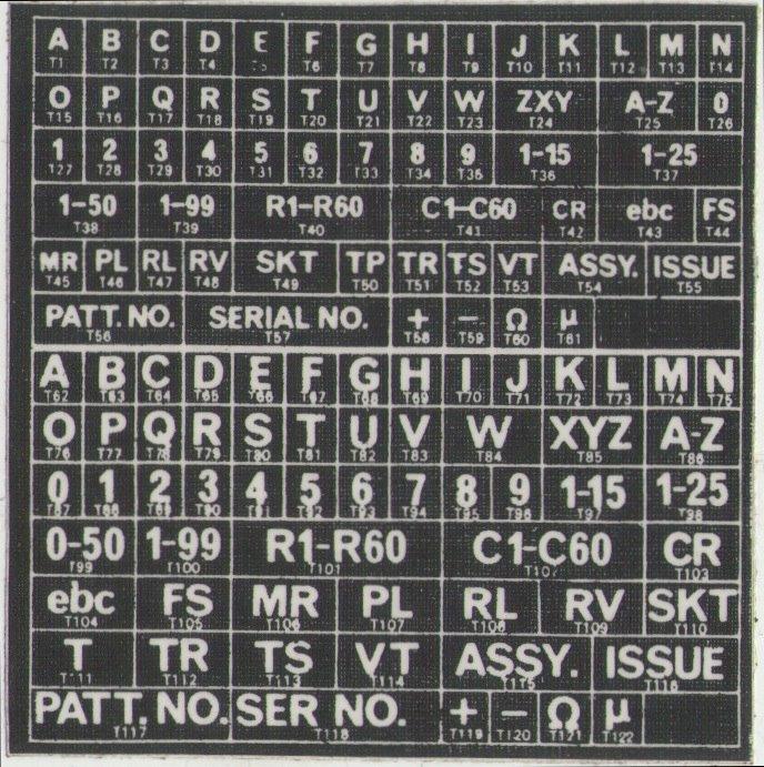
Another Moonbase Alpha label. This is the Grotesque 216 font table as seen in the catalogue, in white text (as used on the red background shown in the screen shot below).
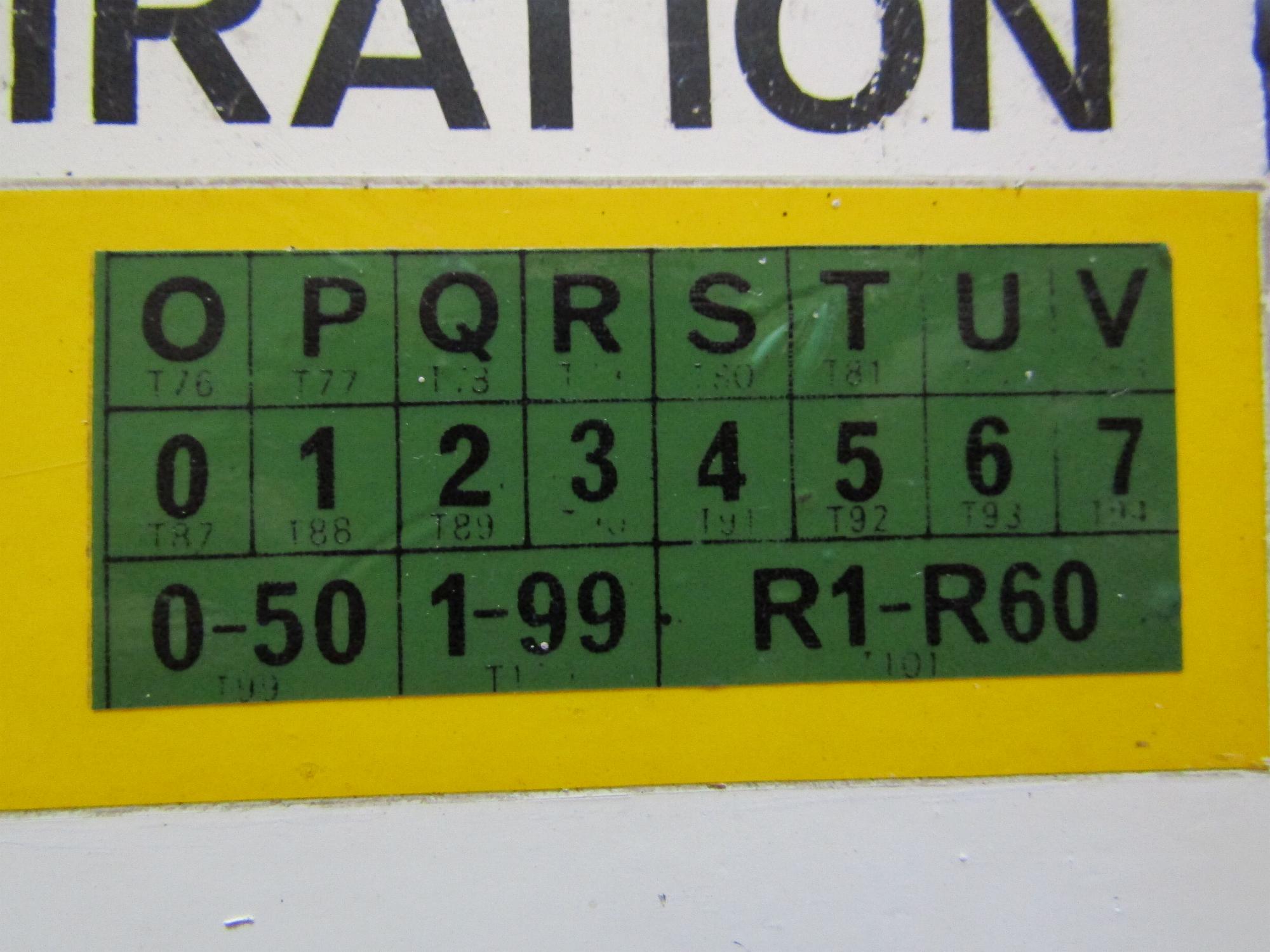
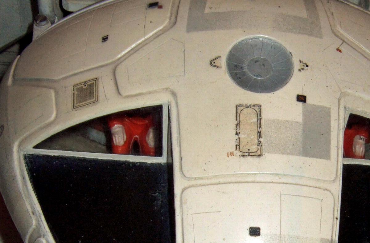
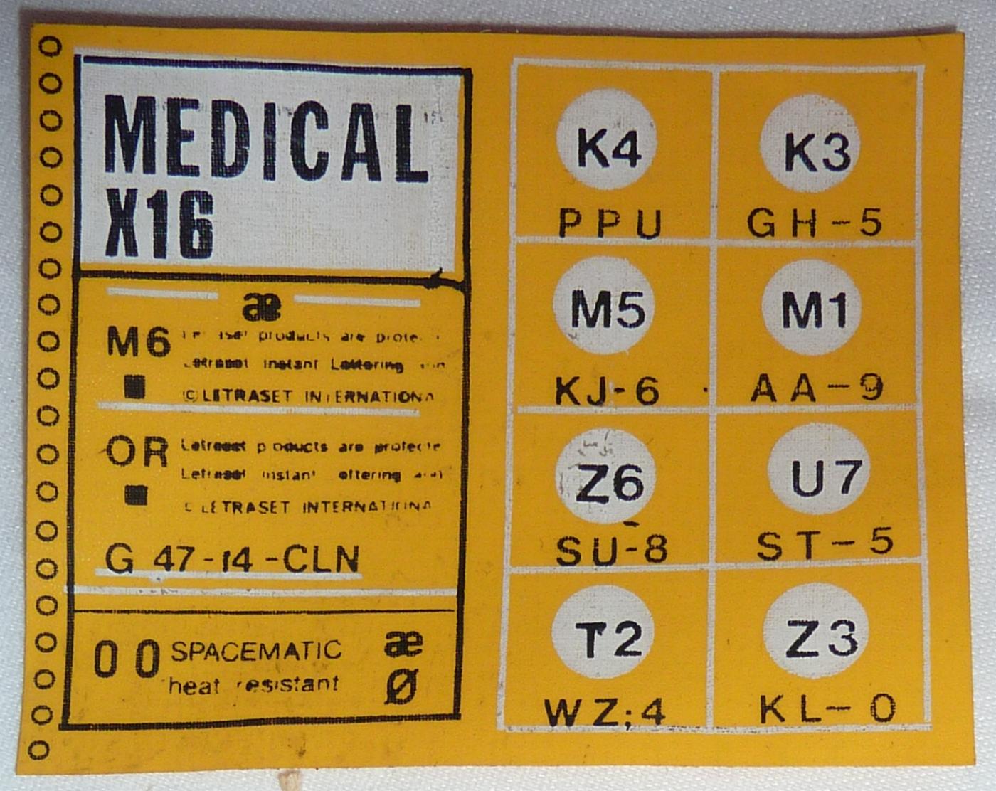
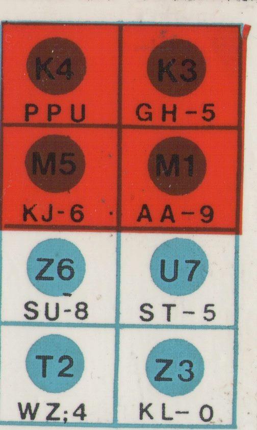
Close-ups of the Medical panel showing the letter grids, complete with order codes.
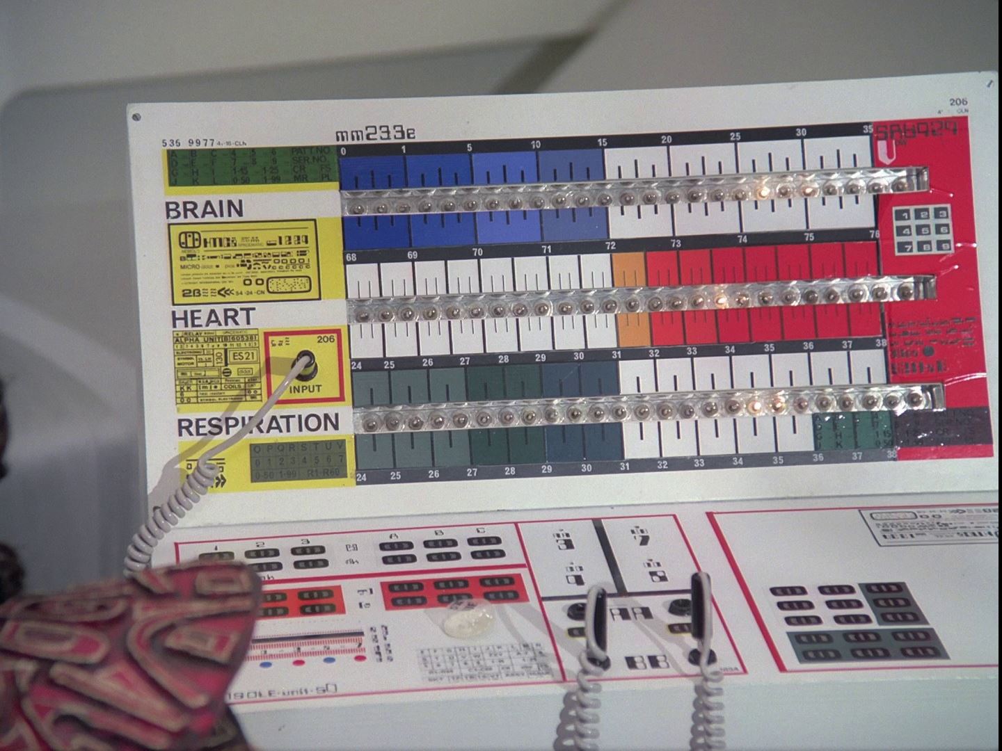
Top right on this Medical panel is the number "206" and the number below "41-18-CLN". This is the sheet number and USA Order number for 18pt Grotesque 216.
This is sheet 206, USA order number 41-18-CLN, for 18pt Grotesque 216. It is a sans serif font designed by Frank Hinman Pierpont (born 1860, died 1937). The Amercian mechanic moved to Germany to work on typesetting machines, then in 1899 he moved to England to work for the American company Monotype. He led the British branch of the company to create popular new typefaces, including Gill Sans, Futura and Times New Roman. Pierpont created Monotype Grotesque family of typefaces in 1926.
This custom label "Blood Transfusion Treatment And Recycle Unit Mk.11.CK.ES" is made with the "Countdown" font- and the name of the font is helpfully written alongside it, with the Letraset ordering number (112-24-CLN, written twice). And bottom right is the name of another font, 24pt DATA 70, which isn't actually on this label at all.
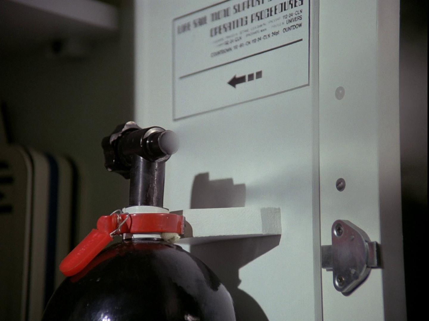
The label here helpfully includes the font name of the title text (24 point Countdown) and the body text (Univers).
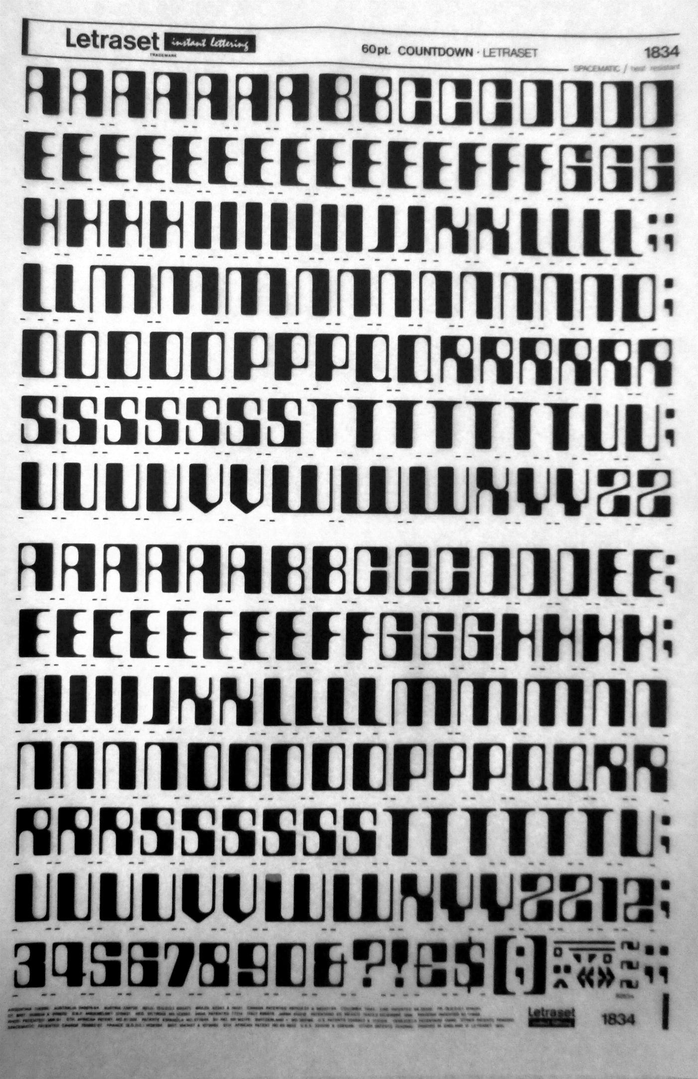
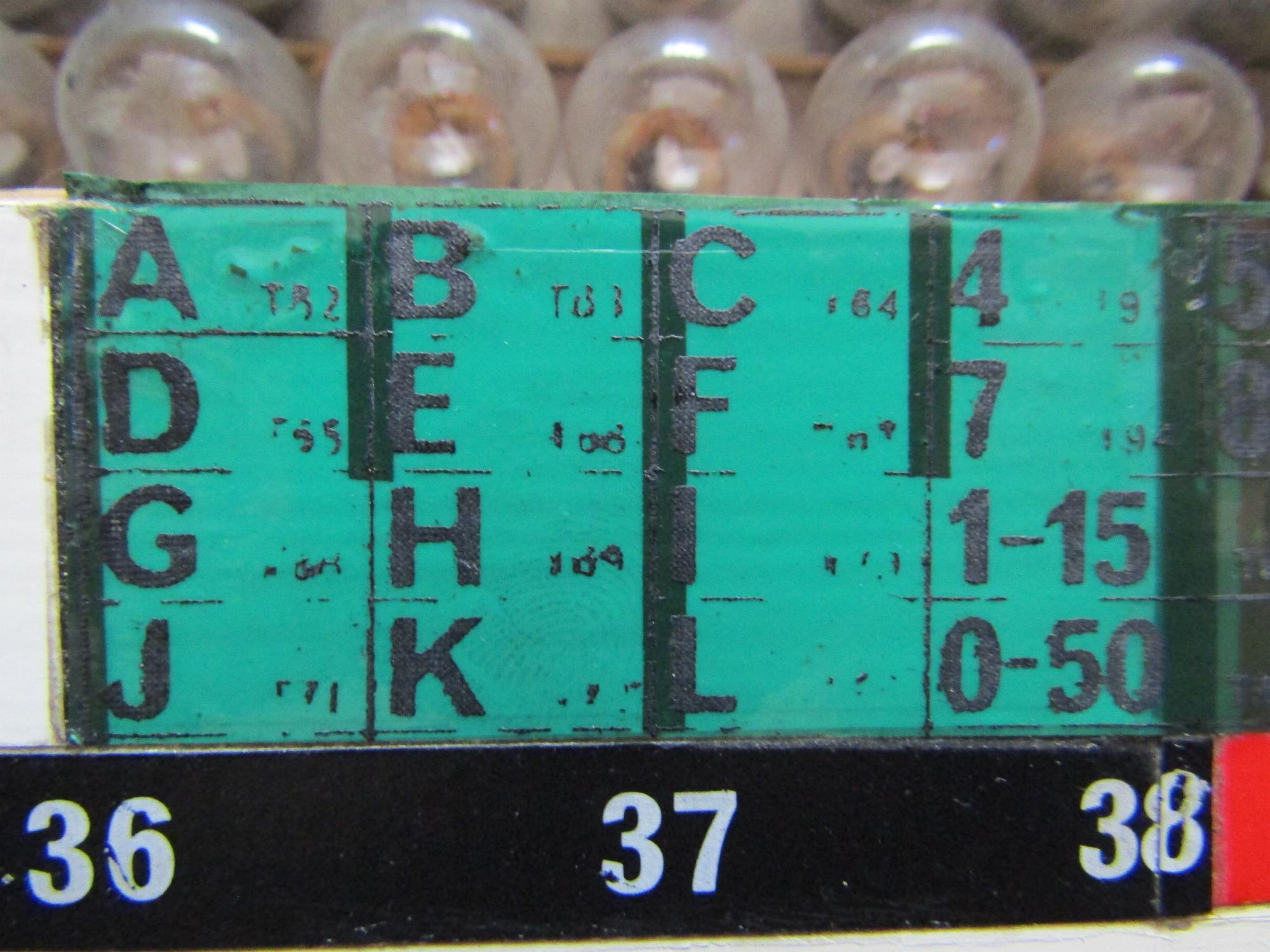
This is Letraset sheet 1834, 60pt Countdown. Countdown was designed by Colin Brignall (born 1940), a fashion photographer who joined Letraset in 1964 and designed Countdown in 1965. In 1980 he was appointed type director for Letraset, and he was awarded the Type Directors Club medal in 2000. Countdown was inspired by MICR E-13B, a font designed to be machine readable. MICR stands for "magnetic ink character recognition" with characters in a 0.013 inch character grid. It was developed in the mid-1950s primarily for bank cheques, which needed to be sorted by account number. Since 1959, almost all cheques have the account number printed in MICR E-13B; it was adopted as an ANSI standard in 1963 and as an ISO standard (ISO 1004:1995). Brignall was inspired by the computer numbers on cheques to create a font for the complete alphabet, rather than just numbers. The boxy, highly stylised letters suggest computers and immediately became popular in the late 1960s and 1970s.
The symbols on the bottom right corner of the Countdown sheet (left) were useful for Moonbase labels (right).
More Countdown
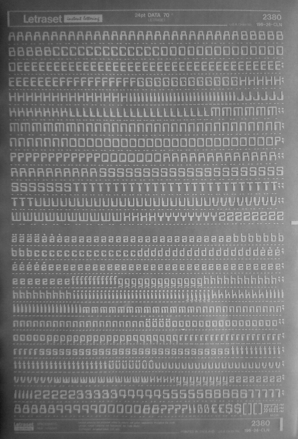
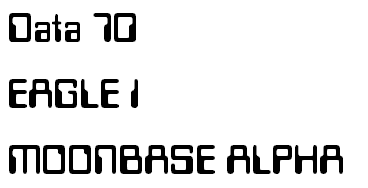
Letraset sheet 2380, 24pt Data 70. Another Letraset font, designed in 1970 by Bob Newman. Like Countdown, it was a deliberate "science fiction" typeface, with square mechanical shapes that was immediately very popular with companies trying to suggest a modern or futuristic image.

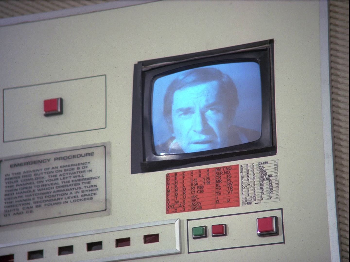
In Missing Link we see a comlock. The "C 83-102" is another Letraset order number. Below the text contains the words "Registered Trade Mark. Letraset Products are prote". This is the Letraset copyright notice from the bottom of the sheets. To make it less obvious, the copyright text is often scratched to obscure it. See commlock prop photos.
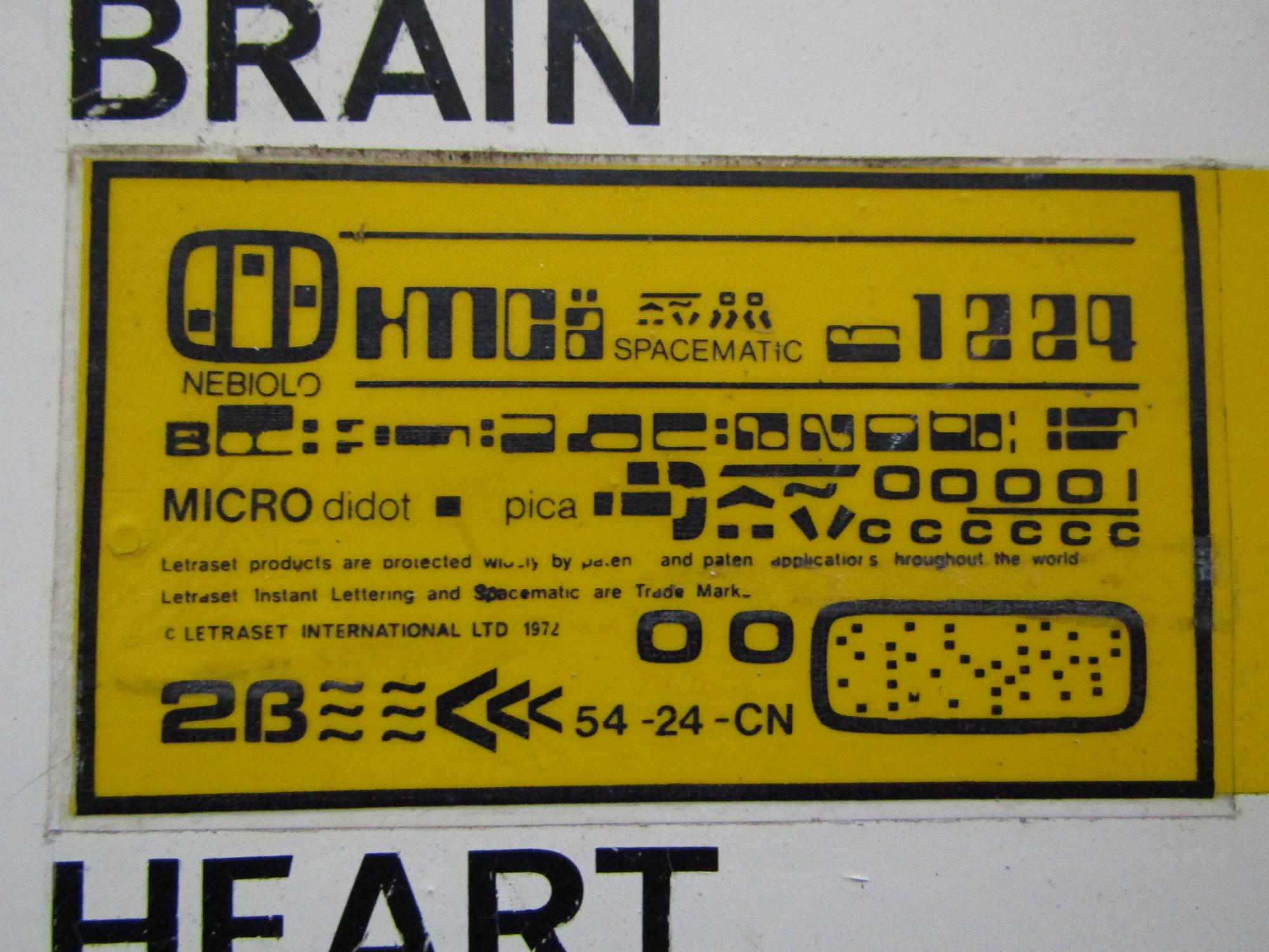
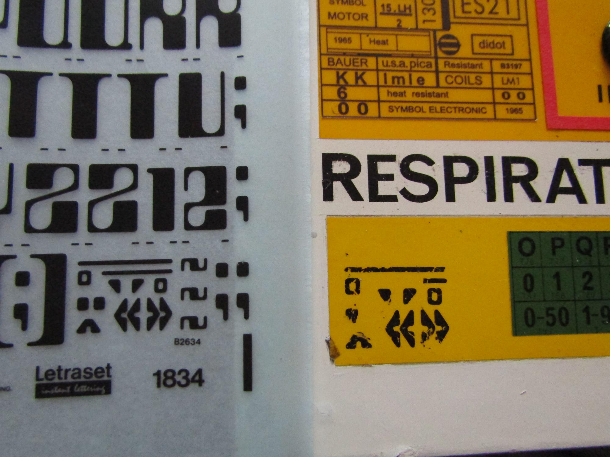
Another label with the Letraset copyright notice, from a 1972 sheet. The font at the top is Countdown. "Spacematic" is the letter spacings system for Letraset. Nebiolo is a font foundry. Micro and didot are fonts. "Pica" is a font size. 54-24-CN is another sheet number,
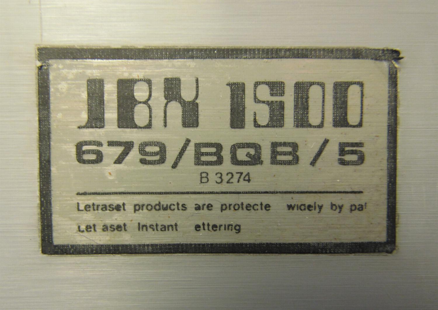
A desk label with the Letraset copyright notice.
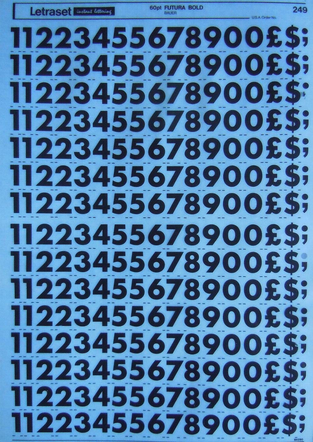
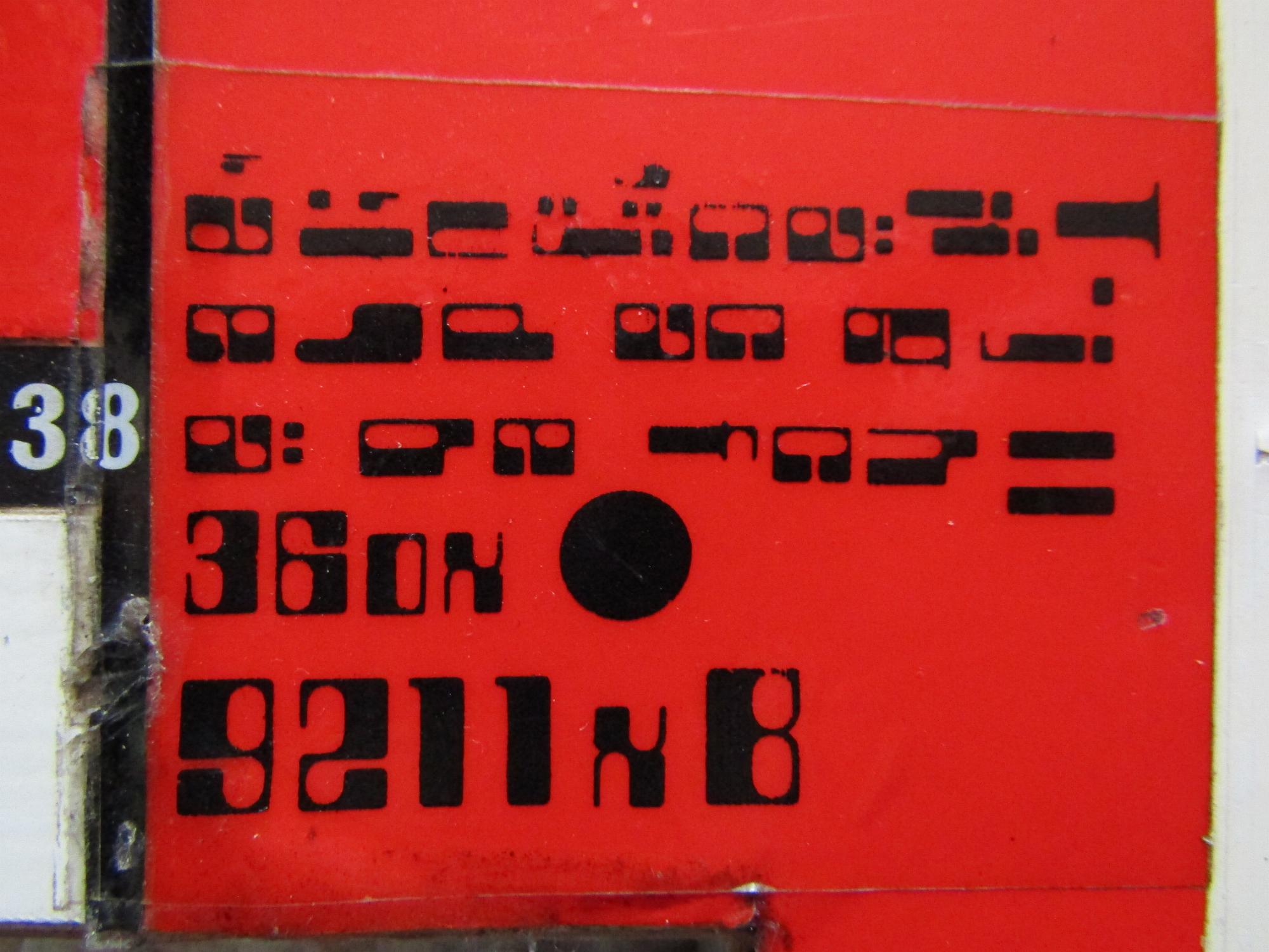
A Letraset numbers sheet, for 60pt Futura Bold from Bauer. Futura was designed in 1927 by the German typeface designer Paul Renner (1878-1956). It is based on simple geometric forms, squares and circles, making the letters cleanly modern. The series titles are in a variation called Futura Heavy.

This is a sheet of white letters for 48pt Univers 59, from Deberny and Peignot. It was designed in 1954 by the Swiss typeface designer Adrian Frutiger (1928-2015). It was a reaction to the geometric sans serif fonts such as Futura, leading a new "Swiss style" that became known as neo-grotesque (another very similar font was Helvetica, designed by Max Miedinger). Univers variations were famously numbered rather than named- 59 here indicates regular weight (5) with ultra-condensed width (9). The Univers font used on labels seems to be condensed or ultra-condensed (57 or 59). Univers is used widely by companies for logos, and for public information signs (most London street signs are Univers Bold Condensed).
Letraset lettering was available in sheets or as 16mm wide tapes. Custom sheets could be ordered if required. Keith Wilson's design department must have ordered dozens of custom sheets, as the same patterns are repeated again and again on different props. Sometimes there wasn't a lot of custom design- the letter tables from Letraset catalogues were reproduced exactly (see, for instance, the All That Glisters radiation instrument).
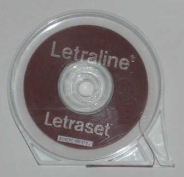
In addition to letters, Letraset also produced rub-down lines to make borders and rule-lines. This "Letraline" came in different thicknesses, colours and patterns. In addition to props, Letraline was widely used on SFX models. Letraset also made colour film - "Letrafilm" - for solid blocks of colour. Red, yellow or green transparent Letrafilm would be cut into rectangles, often with a Letraline border, and the lettering written over it to create a typical Moonbase Alpha label.
The names of the main fonts used can still be read on some of the labels.

The names of the type foundries are also included on labels. The companies that design typefaces are called foundries because, before Letraset dry lettering and computers, the letters were metal blocks which were punched and cast by metal workers.
Some of the numbers in labels are font sizes: 12pt and 14pt are point sizes. 1pt is 0.35mm. Another word seen is "U.S.A. pica", a size of 12 points (4.22mm; the size differs from the French pica).
Letraset was also used for the series on-screen titles including credits and the episode name. The series logo was a custom design.
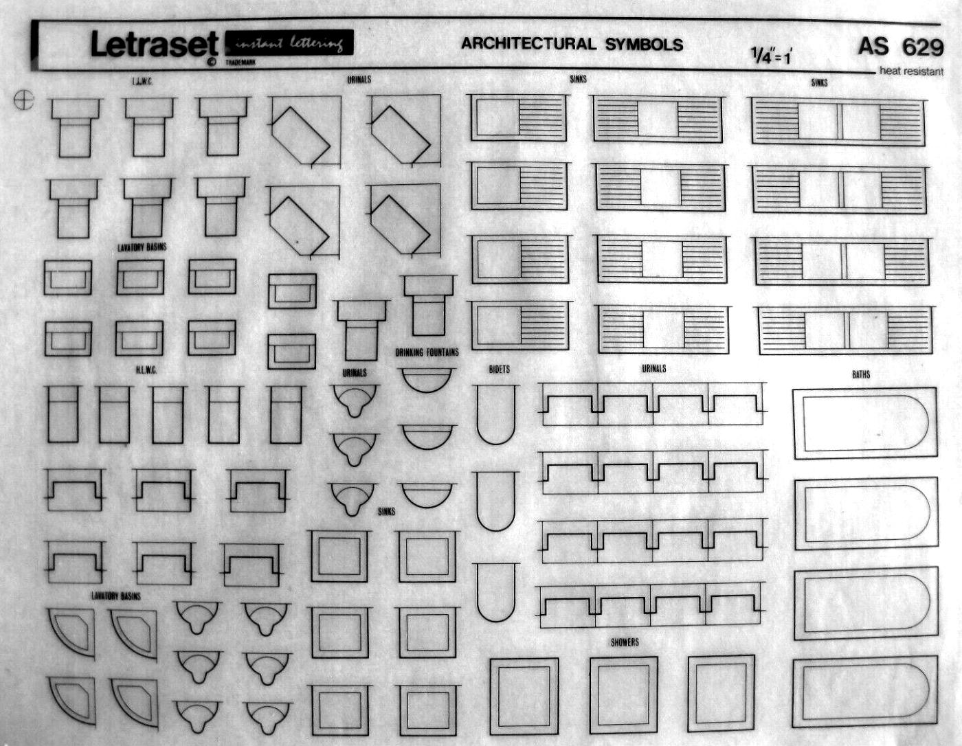
Letraset also produced architectural symbols. Letraset and Letraline was also used to decorate the special effects models. The model makers favoured bathroom fittings, for some reason.
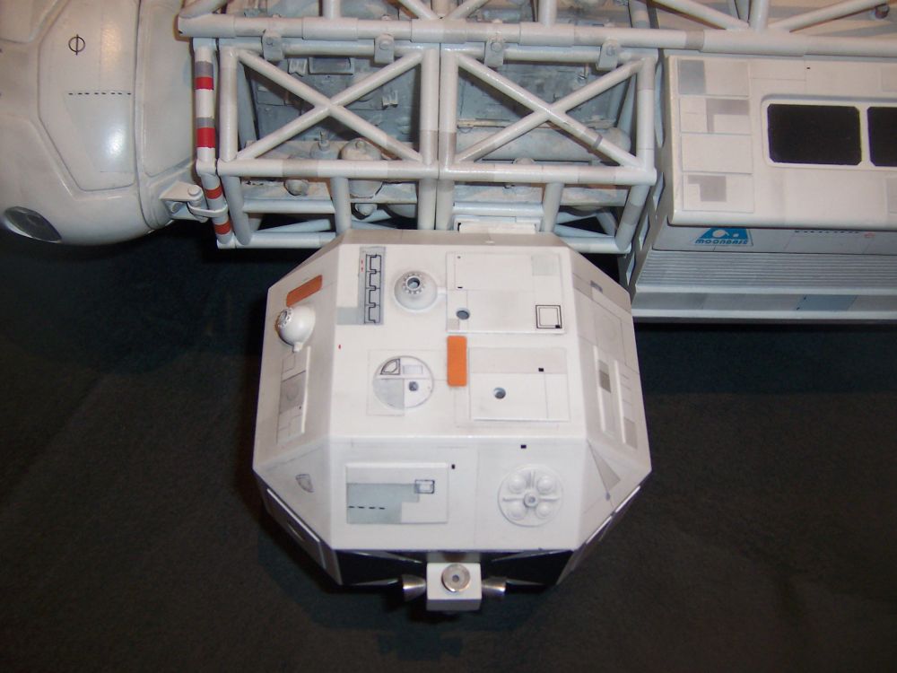
Eagle 1 has some distinctive Letraset on top of the leg pods. See the above sheet for symbols used. At left, a row of urinals. In the circle in front is a lavatory basin. At the right, a shower stall.
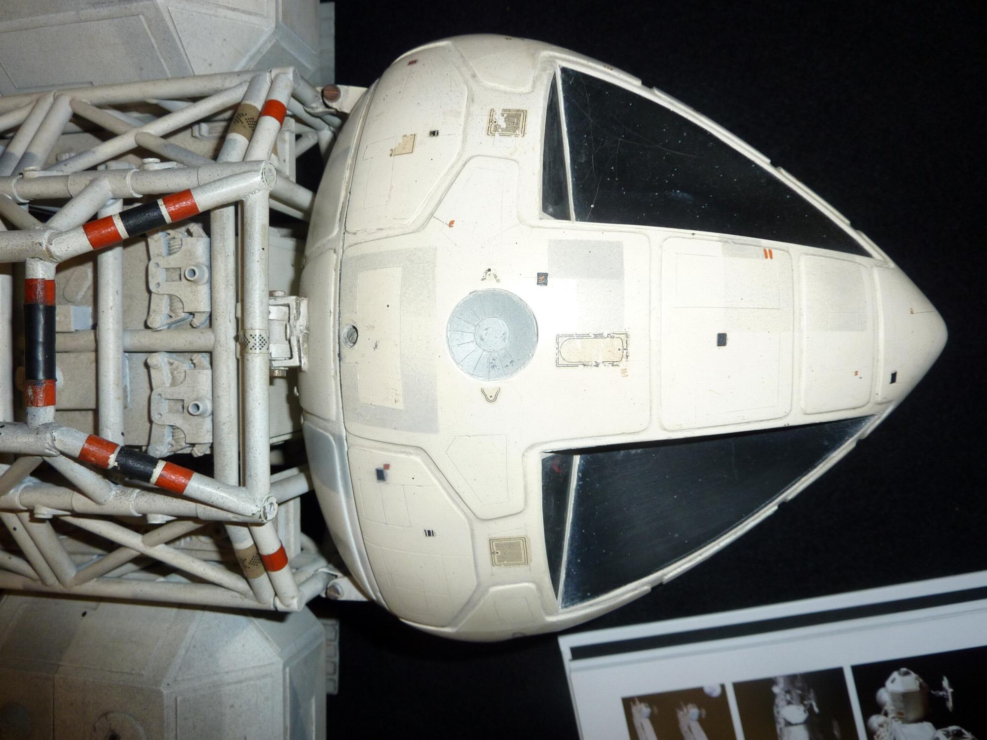
This is Eagle 2 command module, marked with a bath, urinals and showers.
In the centre of the command module, there's a bath symbol. There's also two urinals and shower cubicles. On other parts of the Eagles you can find wash basins and toilets.
See also: signage
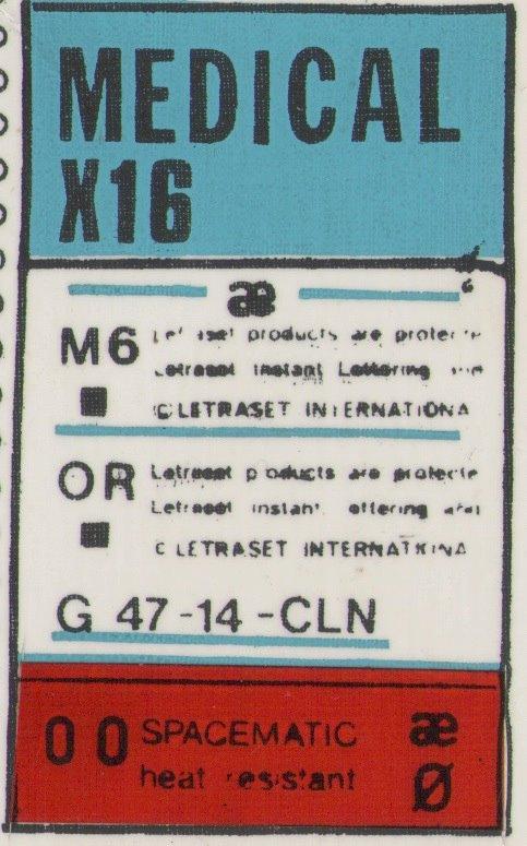
The Letraset sheet "47-14-CLN" is 12pt Helvetica Medium.
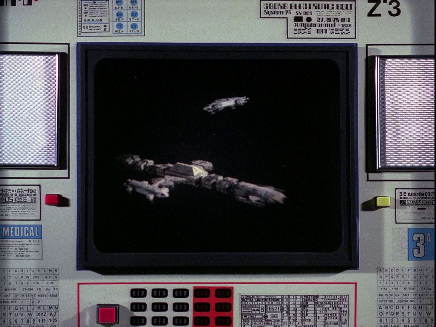
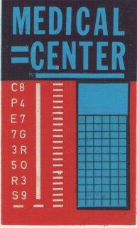
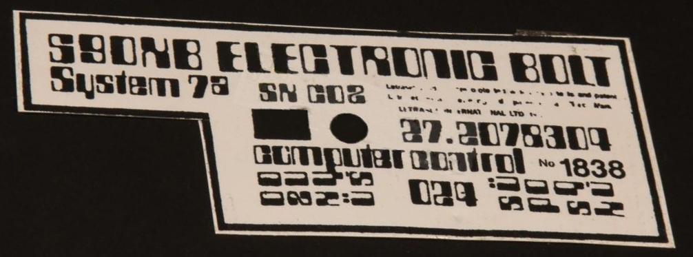
This screen in Space Warp has "Electronic Bolt" and "Alpha Medical" signs, seen below.


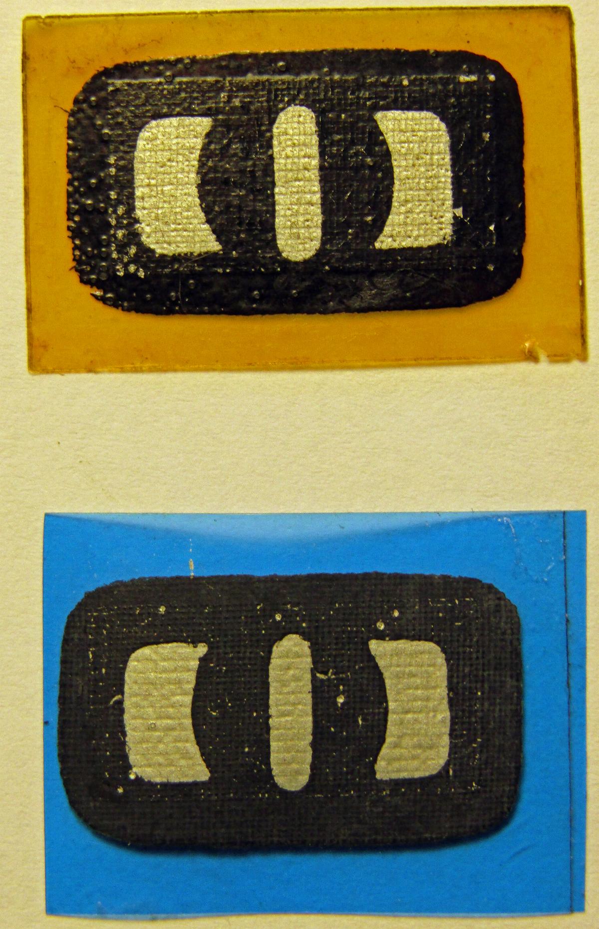
Command Center desks are covered with arrays of these flat "buttons". They are mounted on thick coloured film, yellow, red, blue or white. On that is a silver oblong (see the rear photo below). Then the black pattern is screen-printed on top. The button shape is basically an oval with a letter "O" in the middle. The oval shape is possibly made from two Microgramma Bold "U" letters on their sides. The central "O" font may be Binner. In close-up, the printing of each is slightly different and uneven.

The rear shows the construction- the coloured film base, a silver oblong, and the screen-printed black shapes.
Thanks to James Winch, David Hirsch, Simon Rhodes
Page copyright Martin Willey